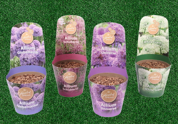
Frylink supplied the flower bulb packaging to two supermarket chains in Switzerland. Because these chains have merged, there was no longer a unity in the presentation of the flower bulb packaging. After all, the packaging consisted of different designs and layouts. In response to this, Frylink posed the following question to Designstar: Can you ensure a uniform and appropriate appearance for the presentation of our flower bulbs?

Four themes
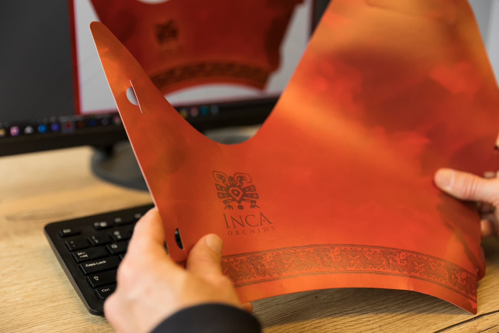
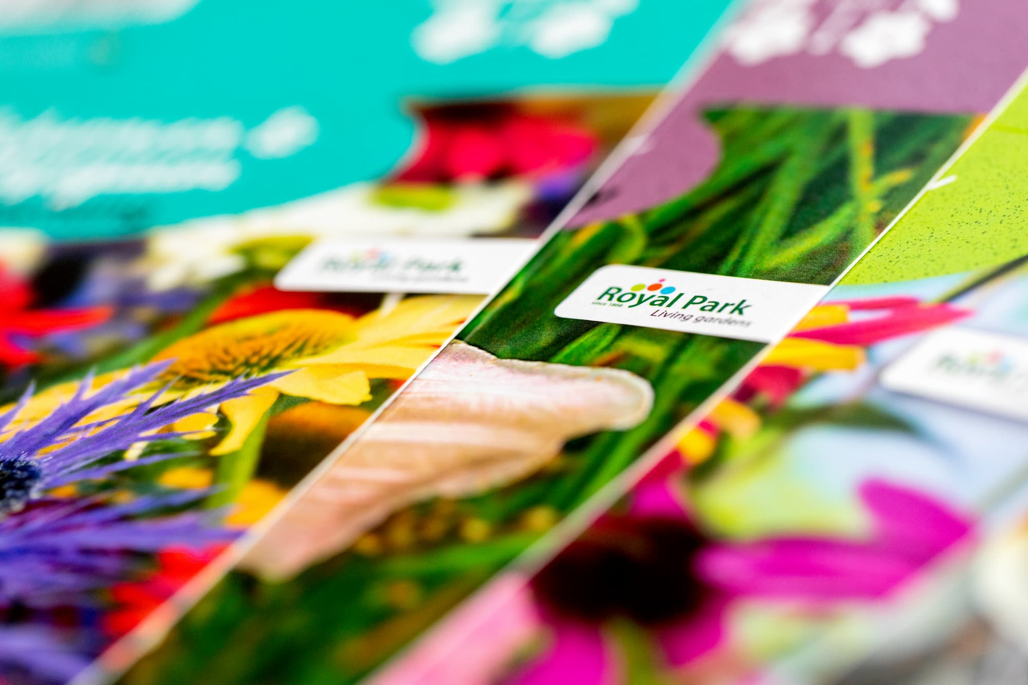
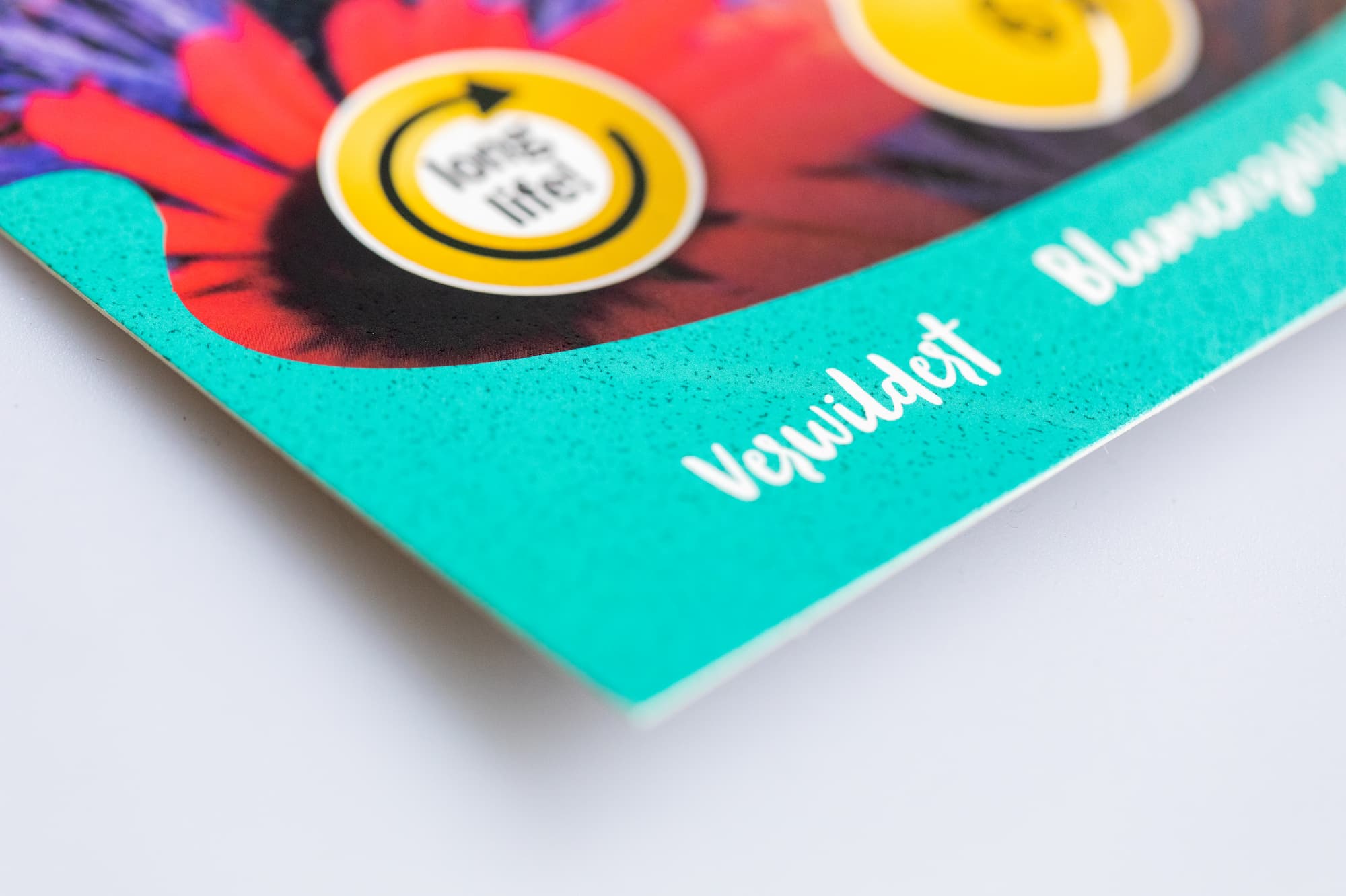
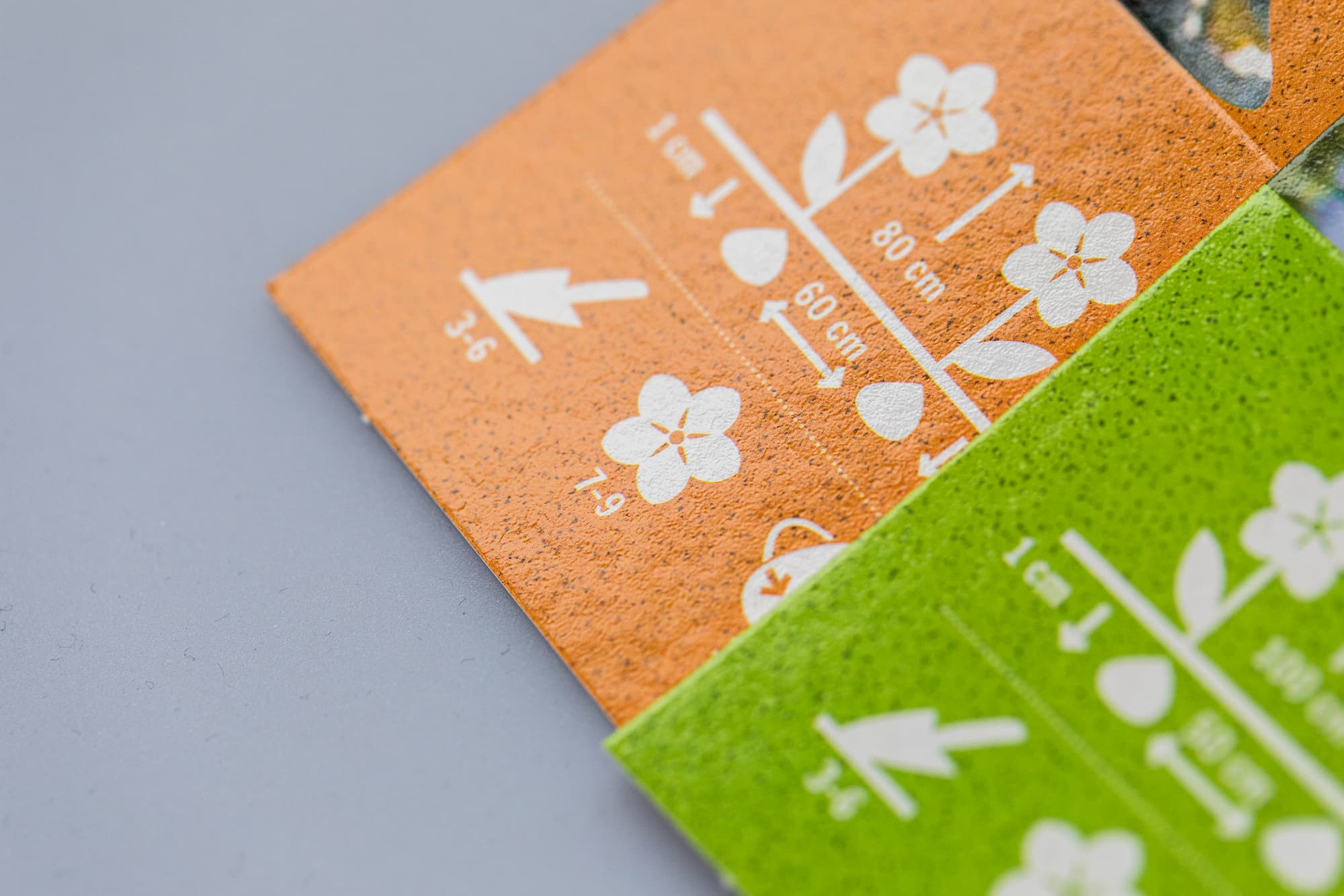
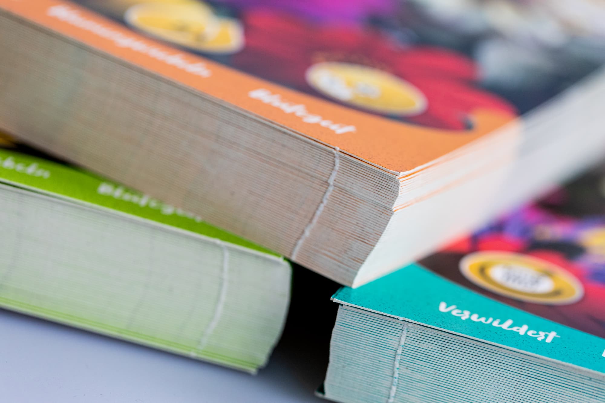
Based on the above question, an appointment was scheduled after which Designstar was allowed to devise a presentation for the sales shelves. Various design concepts have been made for the cappers (the packaging for the flower bulbs). Proposals were also made for the slip cards (the label for the box), the strips that go under the boxes and the banners that are attached to the sales rack.
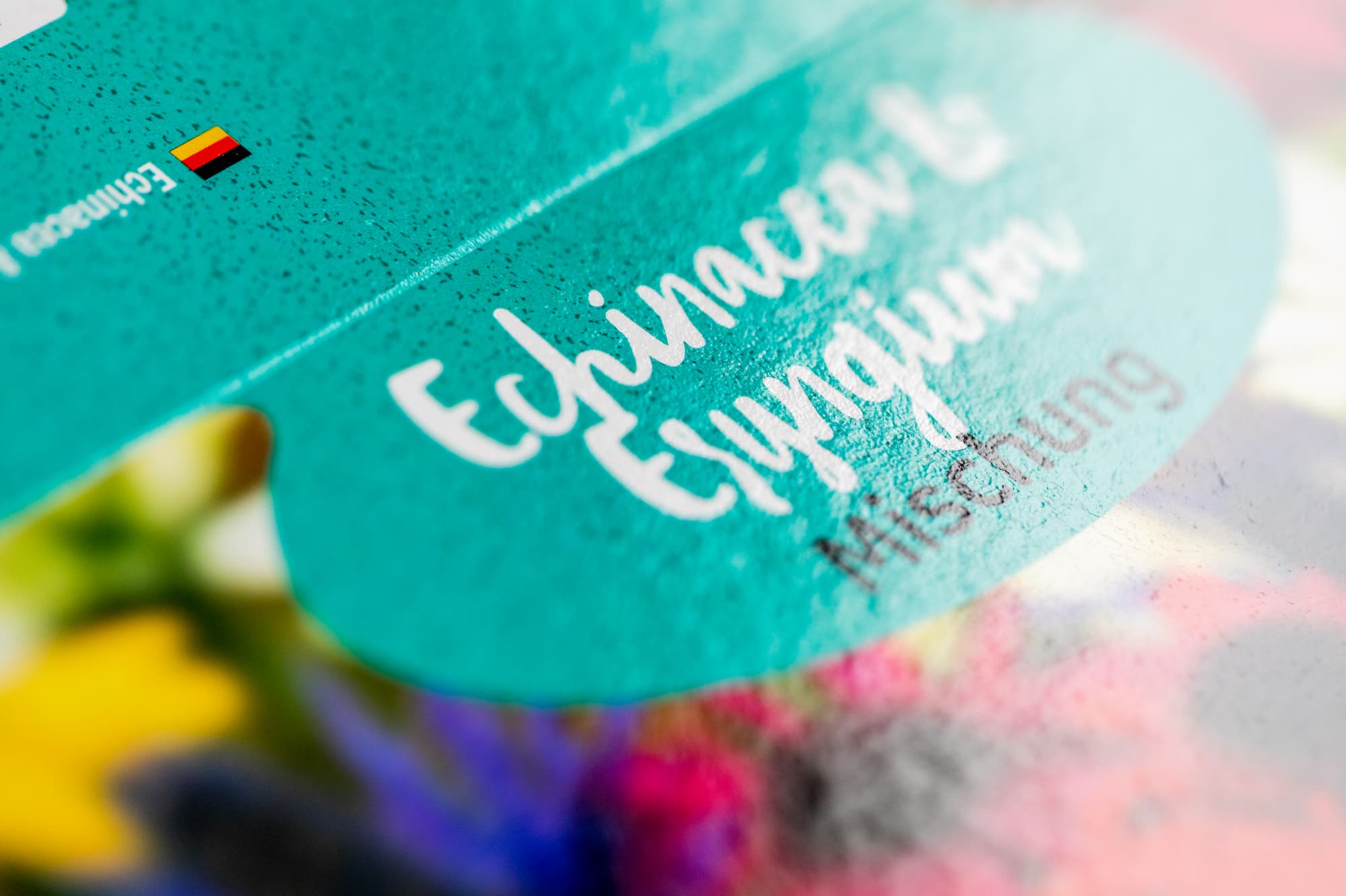
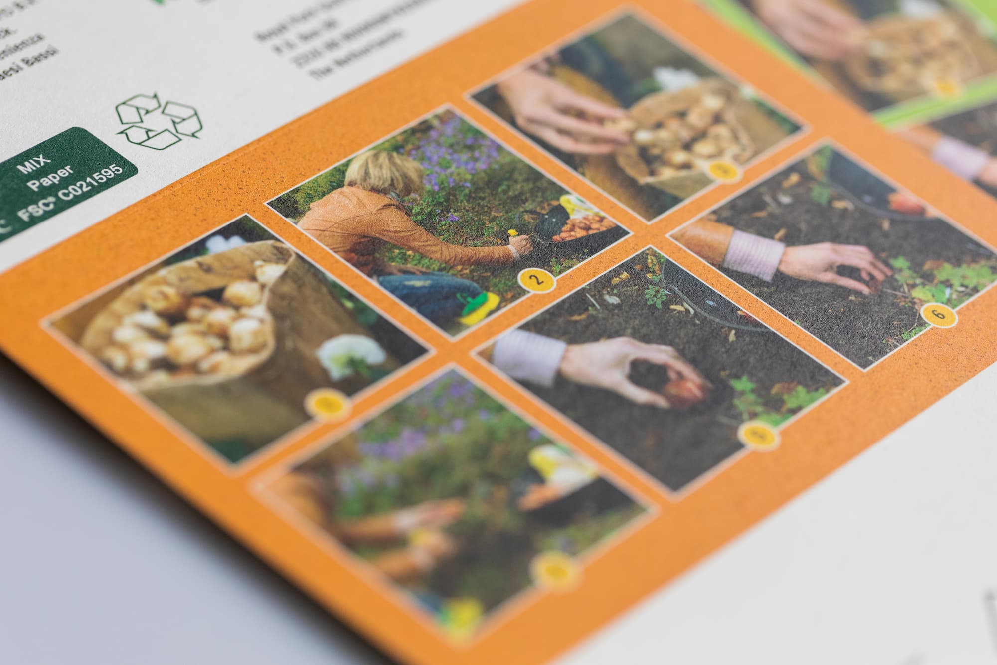
Within the design it was important to take into account the four main themes: insect-friendly, natural, fragrant and cut flowers. Each theme consists of fifteen different types. Matching icons and colors were devised for each theme. The colors and pictograms were reflected in the designs of the cappers, slipper cards, strips and banners, which makes for a beautiful whole. Taking into account the above information, two design proposals were made. These proposals were presented to the client by Frylink. After the choice had been made, the proposal was further elaborated and approved.


Collaboration
The collaboration went very smoothly, which was very pleasant for all parties involved. Corrections were even made on the spot by Frylink in Designstar's office, speeding up the process. The deadline was met and the flower bulbs were delivered on time to the stores in Switzerland.
Conclusion
The Royal Park brand was recognizable by providing both the cappers, the slippers and the shop presentation with an unambiguous appearance. The design offered enough space to clearly communicate Frylink's four themes and Designstar's flexible and fast approach ensured a streamlined handling of the assignment.